This chapter provides codes that can be used to work with the data from Oxford University: Oxford Covid-19 Government Response Tracker (OxCGRT) .
Here, we will focus on 5 large and 5 small European countries, in terms of inhabitants: - “Large countries”: United Kingdom, Spain, Italy, Germany, France, - “Small countries”: Sweden, Belgium, Netherlands, Ireland, Denmark.
Load data
First of all, let us load some packages.
── Attaching core tidyverse packages ──────────────────────── tidyverse 2.0.0 ──
✔ dplyr     1.1.2     ✔ readr     2.1.4
✔ forcats   1.0.0     ✔ stringr   1.5.0
✔ ggplot2   3.4.2     ✔ tibble    3.2.1
✔ lubridate 1.9.2     ✔ tidyr     1.3.0
✔ purrr     1.0.1
── Conflicts ────────────────────────────────────────── tidyverse_conflicts() ──
✖ dplyr::filter() masks stats::filter()
✖ dplyr::lag()    masks stats::lag()
ℹ Use the conflicted package (<http://conflicted.r-lib.org/>) to force all conflicts to become errors
library (lubridate)library (knitr)library (kableExtra)
Attaching package: 'kableExtra'

The following object is masked from 'package:dplyr':

    group_rows
library (RColorBrewer)library (growthmodels)library (minpack.lm)library (scales)
Attaching package: 'scales'

The following object is masked from 'package:purrr':

    discard

The following object is masked from 'package:readr':

    col_factor
'nlstools' has been loaded.

IMPORTANT NOTICE: Most nonlinear regression models and data set examples
related to predictive microbiolgy have been moved to the package 'nlsMicrobio'
library (ggpubr)library (gridExtra)
Attaching package: 'gridExtra'

The following object is masked from 'package:dplyr':

    combine
Let us also define a theme for the graphical outputs, as in Chapter 1
library (grid)<- function (..., size_text = 8 )theme (text = element_text (size = size_text),plot.background = element_rect (fill= "transparent" , color= NA ),panel.background = element_rect (fill = "transparent" , color= NA ),panel.border = element_blank (),axis.text = element_text (), legend.text = element_text (size = rel (1.1 )),legend.title = element_text (size = rel (1.1 )),legend.background = element_rect (fill= "transparent" , color= NULL ),legend.position = "bottom" , legend.direction = "horizontal" , legend.box = "vertical" ,legend.key = element_blank (),panel.spacing = unit (1 , "lines" ),panel.grid.major = element_line (colour = "grey90" ), panel.grid.minor = element_blank (),plot.title = element_text (hjust = 0 , size = rel (1.3 ), face = "bold" ),plot.title.position = "plot" ,plot.margin = unit (c (1 , 1 , 1 , 1 ), "lines" ),strip.background = element_rect (fill= NA , colour = NA ),strip.text = element_text (size = rel (1.1 )))
Let us modify the locale settings. This depends on the OS. For Windows users:
Sys.setlocale ("LC_ALL" , "English_United States" )
For Unix users:
# Only for Unix users Sys.setlocale ("LC_ALL" , "en_US.UTF-8" )
[1] "en_US.UTF-8/en_US.UTF-8/en_US.UTF-8/C/en_US.UTF-8/en_US.UTF-8"
Confirmed and Deaths data
As mentioned at the beginning of the notebook, we rely on Oxford Covid-19 Government Response Tracker (OxCGRT) data.
Let us define the vector of country names:
<- c ("United Kingdom" , "Spain" , "Italy" , "Germany" , "France" , "Sweden" , "Belgium" , "Netherlands" , "Ireland" , "Denmark" )<- c ("United Kingdom" , "Spain" , "Italy" , "Germany" , "France" )<- c ("Sweden" , "Belgium" , "Netherlands" , "Ireland" , "Denmark" )
The raw data can be downloaded as follows:
<- read.csv ("https://raw.githubusercontent.com/OxCGRT/covid-policy-tracker/master/data/OxCGRT_nat_latest.csv" )
Then we save those:
dir.create ("data" )save (df_oxford, file = "data/df_oxford.rda" )
Let us load the saved data (data saved on May 29, 2023):
The dimensions are the following:
Let us focus first on the number of confirmed cases:
<- |> select (country = CountryName, country_code = CountryCode,date = Date,value = ConfirmedCases,stringency_index = StringencyIndex_Average) |> filter (country %in% names_countries) |> as_tibble () |> mutate (date = ymd (date),days_since_2020_01_22 = :: interval (:: ymd ("2020-01-22" ), date) / lubridate:: ddays (1 )
We can do the same for the number of deaths:
<- |> select (country = CountryName, country_code = CountryCode,date = Date,value = ConfirmedDeaths, stringency_index = StringencyIndex_Average) |> filter (country %in% names_countries) |> as_tibble () |> mutate (date = ymd (date),days_since_2020_01_22 = :: interval (:: ymd ("2020-01-22" ), date) / lubridate:: ddays (1 )
Population
Let us define rough values for the population of each country:
<- tribble (~ country, ~ pop,"France" , 70e6 ,"Germany" , 83e6 ,"Italy" , 61e6 ,"Spain" , 47e6 ,"United Kingdom" , 67e6 ,"Belgium" , 12e6 ,"Denmark" , 6e6 ,"Ireland" , 5e6 ,"Netherlands" , 18e6 ,"Sweden" , 11e6
Filtering data
In this notebook, let us use data up to September 30th, 2020. Let us keep only those data and extend the date up to November 3rd, 2020 (to assess the goodness of fit of the models with unseen data).
<- lubridate:: ymd ("2020-09-30" )<- lubridate:: ymd ("2020-10-31" )<- confirmed_df |> filter (date <= end_date_data)<- deaths_df |> filter (date <= end_date_data)
Defining start and end dates for a “first wave”
We create a table that gives some dates for each country, adopting the following convention:
start_first_wave: start of the first wave, defined as the first date when the cumulative number of cases is greater than 1start_high_stringency: date at which the stringency index reaches its maximum value during the first 100 days of the samplestart_reduce_restrict: moment at which the restrictions of the first wave starts to lowerstart_date_sample_second_wave: 60 days after the relaxation of restrictions (60 days after after start_reduce_restrict)length_high_stringency: number of days between start_high_stringency and
# Start of the outbreak <- |> group_by (country) |> arrange (date) |> filter (value > 0 ) |> slice (1 ) |> select (country, start_first_wave = date)
The start of period with highest severity index among the first 100 days:
<- |> group_by (country) |> slice (1 : 100 ) |> arrange (desc (stringency_index), date) |> slice (1 ) |> select (country, start_high_stringency = date)
The moment at which the restrictions of the first wave starts to lower:
<- |> group_by (country) |> arrange (date) |> left_join (start_high_stringency, by = "country" ) |> filter (date >= start_high_stringency) |> mutate (tmp = dplyr:: lag (stringency_index)) |> mutate (same_strin = stringency_index == tmp) |> mutate (same_strin = ifelse (row_number ()== 1 , TRUE , same_strin)) |> filter (same_strin == FALSE ) |> slice (1 ) |> select (country, start_reduce_restrict = date)
The assumed start of the second wave:
<- |> mutate (start_date_sample_second_wave = start_reduce_restrict + :: ddays (60 )|> select (country, start_date_sample_second_wave)
Then, we can put all these dates into a single table:
<- |> left_join (start_high_stringency, by = "country" ) |> left_join (start_reduce_restrict, by = "country" ) |> left_join (start_date_sample_second_wave, by = "country" )
Individual Data
Li et al. (2020 ) estimated the distribution of the incubation period by fitting a lognormal distribution on exposure histories, leading to an estimated mean of 5.2 days, a 0.95 confidence interval of [4.1,7.0] and the 95th percentile of 12.5 days.
This corresponds to a lognormal density with parameters \(\mu = 1.43\) and \(\sigma = 0.67\) :
<- function (x){# For finding gamma parameters of the serial interval distribution Li etal 2020 = x[1 ]= x[2 ]7.5 - a* s)^ 2 + (3.4 - sqrt (a)* s)^ 2 = c (4 ,2 )optim (x,func)
$par
[1] 4.866009 1.541308

$value
[1] 9.522571e-10

$counts
function gradient
      67       NA

$convergence
[1] 0

$message
NULL
The mean serial interval is defined as the time between the onset of symptoms in a primary case and the onset of symptoms in secondary cases. Li et al. (2020 ) fitted a gamma distribution to data from cluster investigations. They found a mean time of 7.5 days (SD = 3.4) with a 95% confidence interval of [5.3,19].
The corresponding parameters for the Gamma distribution can be obtained as follows:
<- 7.5 <- 3.4 <- (mean_si / std_si)^ 2 <- mean_si / shapestr_c ("Shape = " , shape, ", Scale = " , scale)
[1] "Shape = 4.8659169550173, Scale = 1.54133333333333"
The quantile of order .999 for such parameters is equal to:
<- ceiling (qgamma (p = .99 , shape = shape, scale = scale))
Descriptive statistics
Let us assign a colour to each country within each group (large or small countries)
<- rep (c ("#1F78B4" , "#33A02C" , "#E31A1C" , "#FF7F00" , "#6A3D9A" ), 2 )<- colours_lugaminames (colours_lugami_names) <- names_countries<- tibble (colour = colours_lugami_names,country = names (colours_lugami_names)) |> left_join (country_codes, by = c ("country" ))
# A tibble: 10 × 3
   colour  country        country_code
   <chr>   <chr>          <chr>
 1 #1F78B4 United Kingdom GBR
 2 #33A02C Spain          ESP
 3 #E31A1C Italy          ITA
 4 #FF7F00 Germany        DEU
 5 #6A3D9A France         FRA
 6 #1F78B4 Sweden         SWE
 7 #33A02C Belgium        BEL
 8 #E31A1C Netherlands    NLD
 9 #FF7F00 Ireland        IRL
10 #6A3D9A Denmark        DNK
Keep also a track of that in a vector (useful for graphs with {ggplot2}):
<- colour_table$ colournames (colour_countries) <- colour_table$ country_code
      GBR       ESP       ITA       DEU       FRA       SWE       BEL       NLD
"#1F78B4" "#33A02C" "#E31A1C" "#FF7F00" "#6A3D9A" "#1F78B4" "#33A02C" "#E31A1C"
      IRL       DNK
"#FF7F00" "#6A3D9A"
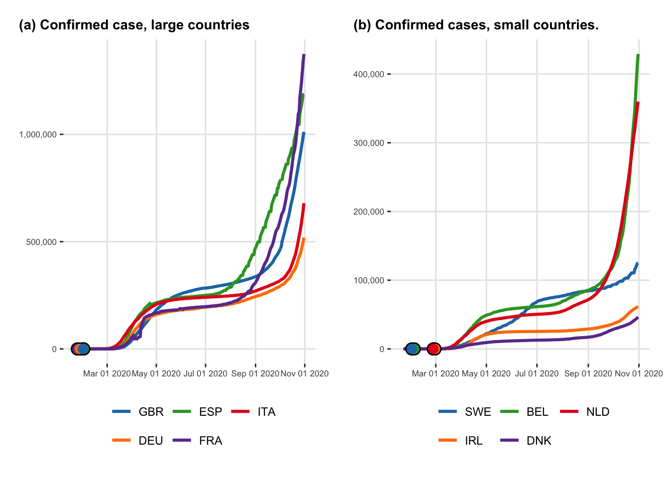
Let us create two figures that shows the evolution of the cumulative number of cases through time and the cumulative number of deaths through time, respectively.
To that end, we need to reshape the data. First, we need a table in which each row gives the value to be plotted for a given date, a given country and a given type of variable (confirmed cases or recovered).
<- |> mutate (type = "Cases" ) |> bind_rows (|> mutate (type = "Deaths" )|> mutate (type = factor (type, levels = c ("Cases" , "Deaths" , "Recovered" )))
# A tibble: 6,100 × 7
   country country_code date       value stringency_index days_since_2020_01_22
   <chr>   <chr>        <date>     <int>            <dbl>                 <dbl>
 1 Belgium BEL          2020-01-01    NA                0                   -21
 2 Belgium BEL          2020-01-02    NA                0                   -20
 3 Belgium BEL          2020-01-03    NA                0                   -19
 4 Belgium BEL          2020-01-04    NA                0                   -18
 5 Belgium BEL          2020-01-05    NA                0                   -17
 6 Belgium BEL          2020-01-06    NA                0                   -16
 7 Belgium BEL          2020-01-07    NA                0                   -15
 8 Belgium BEL          2020-01-08    NA                0                   -14
 9 Belgium BEL          2020-01-09    NA                0                   -13
10 Belgium BEL          2020-01-10    NA                0                   -12
# ℹ 6,090 more rows
# ℹ 1 more variable: type <fct>
From this table, we can only keep cases and deaths cumulative values, filter the observation to keep only those after January 21, 2020. Let us also add for each line, whether the country it corresponds to is small or large (we will create two panels in the graphs). We can also add the country code.
<- |> filter (type %in% c ("Cases" , "Deaths" )) |> filter (date >= ymd ("2020-01-21" )) |> mutate (country_type = ifelse (country %in% names_countries_large, yes = "L" , "S" ),country_type = factor (levels = c ("L" , "S" ),labels = c ("Larger countries" , "Smaller countries" )|> left_join (country_codes, by = c ("country" , "country_code" ))
# A tibble: 5,700 × 8
   country country_code date       value stringency_index days_since_2020_01_22
   <chr>   <chr>        <date>     <int>            <dbl>                 <dbl>
 1 Belgium BEL          2020-01-21    NA             0                       -1
 2 Belgium BEL          2020-01-22     0             0                        0
 3 Belgium BEL          2020-01-23     0             0                        1
 4 Belgium BEL          2020-01-24     0             0                        2
 5 Belgium BEL          2020-01-25     0             0                        3
 6 Belgium BEL          2020-01-26     0             0                        4
 7 Belgium BEL          2020-01-27     0             0                        5
 8 Belgium BEL          2020-01-28     0             5.56                     6
 9 Belgium BEL          2020-01-29     0             5.56                     7
10 Belgium BEL          2020-01-30     0             5.56                     8
# ℹ 5,690 more rows
# ℹ 2 more variables: type <fct>, country_type <fct>
We want the labels of the legends for the countries to be ordered in a specific way. To that end, let us create two variables that specify this order:
<- c ("GBR" , "ESP" , "ITA" , "DEU" , "FRA" )<- c ("SWE" , "BEL" , "NLD" , "IRL" , "DNK" )
Confirmed cases
Let us focus on the confirmed cases here. We can create two tables: one for the large countries, and another one for small ones:
<- |> filter (country_type == "Larger countries" ) |> filter (type == "Cases" )
And for small countries:
<- |> filter (country_type == "Smaller countries" ) |> filter (type == "Cases" )
As we would like the graphs to display the day at which the stringency index reaches its max value for the first time, we need to extract the cumulative number of cases at the corresponding dates.
<- |> rename (date = start_first_wave) |> left_join (|> filter (type == "Cases" ),by = c ("country" , "date" )
# A tibble: 10 × 11
# Groups:   country [10]
   country        date       start_high_stringency start_reduce_restrict
   <chr>          <date>     <date>                <date>
 1 Belgium        2020-02-04 2020-03-20            2020-05-05
 2 Denmark        2020-02-27 2020-03-18            2020-04-15
 3 France         2020-01-24 2020-03-17            2020-05-11
 4 Germany        2020-01-27 2020-03-22            2020-05-03
 5 Ireland        2020-02-29 2020-04-06            2020-05-18
 6 Italy          2020-01-31 2020-03-20            2020-04-10
 7 Netherlands    2020-02-27 2020-03-23            2020-05-11
 8 Spain          2020-02-01 2020-03-30            2020-05-04
 9 Sweden         2020-02-01 2020-04-01            2020-06-13
10 United Kingdom 2020-01-31 2020-03-24            2020-05-11
# ℹ 7 more variables: start_date_sample_second_wave <date>, country_code <chr>,
#   value <int>, stringency_index <dbl>, days_since_2020_01_22 <dbl>,
#   type <fct>, country_type <fct>
The two plots can be created:
<- ggplot (data = df_plot_evolution_numbers_dates_L |> mutate (country_code = factor (country_code, levels = order_countries_L)mapping = aes (x = date, y = value, colour = country_code)+ geom_line (linewidth = 1.1 ) + geom_point (data = df_lockdown_plot |> filter (%in% unique (df_plot_evolution_numbers_dates_L$ country)colour = "black" , size = 4 + geom_point (data = df_lockdown_plot |> filter (country %in% unique (df_plot_evolution_numbers_dates_L$ country)),mapping = aes (colour = country_code), size = 3 , show.legend = F+ scale_shape_discrete ("Lockdown" ) + scale_fill_manual (NULL , values = colour_countries, guide = "none" ) + scale_colour_manual (NULL , values = colour_countries) + labs (x = NULL , y = NULL ) + scale_y_continuous (labels = comma) + scale_x_date (breaks = ymd (pretty_dates (df_plot_evolution_numbers_dates$ date, n = 5 )), date_labels = "%b %d %Y" + theme_paper () + guides (colour = guide_legend (nrow = 2 , byrow = TRUE ))
and for small countries:
<- ggplot (data = df_plot_evolution_numbers_dates_S |> mutate (country_code = factor (country_code, levels = order_countries_S)mapping = aes (x = date, y = value, colour = country_code)+ geom_line (linewidth = 1.1 ) + geom_point (data = df_lockdown_plot |> filter (country %in% unique (df_plot_evolution_numbers_dates_S$ country)),colour = "black" , size = 4 + geom_point (data = df_lockdown_plot |> filter (country %in% unique (df_plot_evolution_numbers_dates_S$ country)),mapping = aes (colour = country_code), size = 3 , show.legend = F+ scale_shape_discrete ("Lock-down" ) + scale_fill_manual (NULL , values = colour_countries, guide = "none" ) + scale_colour_manual (NULL , values = colour_countries) + labs (x = NULL , y = NULL ) + scale_y_continuous (labels = comma) + scale_x_date (breaks = ymd (pretty_dates (df_plot_evolution_numbers_dates$ date, n = 5 )), date_labels = "%b %d %Y" ) + theme_paper () + guides (colour = guide_legend (nrow = 2 , byrow = TRUE ))
These two plots can be put together on a single one:
<- arrangeGrob (# Row 1 + labs (y = NULL , title = "(a) Confirmed case, large countries" ),+ labs (y = NULL , title = "(b) Confirmed cases, small countries." ),nrow = 1 |> as_ggplot ()
Warning: Removed 5 rows containing missing values (`geom_line()`).
Removed 5 rows containing missing values (`geom_line()`).
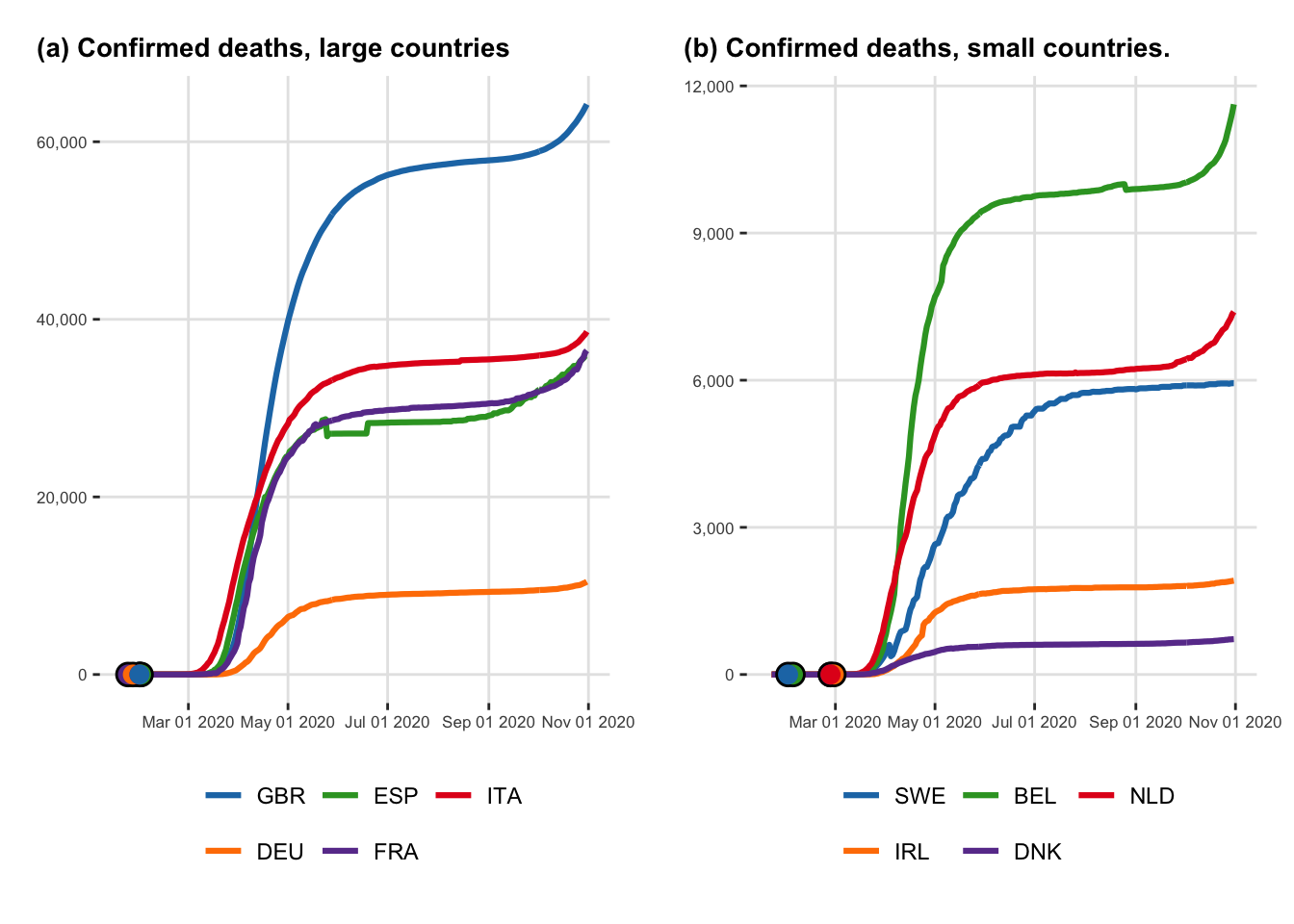
Deaths
Let us focus on the number of deaths here. We can create two tables: one for the large countries, and another one for small ones:
<- |> filter (country_type == "Larger countries" ) |> filter (type == "Deaths" )
And for small countries:
<- |> filter (country_type == "Smaller countries" ) |> filter (type == "Deaths" )
As we would like the graphs to display the day at which the stringency index becomes greater or equal to 60 for the first time, we need to extract the cumulative number of cases at the corresponding dates.
<- |> rename (date = start_first_wave) |> left_join (|> filter (type == "Deaths" ),by = c ("country" , "date" )
# A tibble: 10 × 11
# Groups:   country [10]
   country        date       start_high_stringency start_reduce_restrict
   <chr>          <date>     <date>                <date>
 1 Belgium        2020-02-04 2020-03-20            2020-05-05
 2 Denmark        2020-02-27 2020-03-18            2020-04-15
 3 France         2020-01-24 2020-03-17            2020-05-11
 4 Germany        2020-01-27 2020-03-22            2020-05-03
 5 Ireland        2020-02-29 2020-04-06            2020-05-18
 6 Italy          2020-01-31 2020-03-20            2020-04-10
 7 Netherlands    2020-02-27 2020-03-23            2020-05-11
 8 Spain          2020-02-01 2020-03-30            2020-05-04
 9 Sweden         2020-02-01 2020-04-01            2020-06-13
10 United Kingdom 2020-01-31 2020-03-24            2020-05-11
# ℹ 7 more variables: start_date_sample_second_wave <date>, country_code <chr>,
#   value <int>, stringency_index <dbl>, days_since_2020_01_22 <dbl>,
#   type <fct>, country_type <fct>
The two plots can be created:
<- ggplot (data = df_plot_evolution_numbers_dates_L |> mutate (country_code = factor (country_code, levels = order_countries_L)mapping = aes (x = date, y = value, colour = country_code)+ geom_line (linewidth = 1.1 ) + geom_point (data = df_lockdown_plot |> filter (country %in% unique (df_plot_evolution_numbers_dates_L$ country)),colour = "black" , size = 4 + geom_point (data = df_lockdown_plot |> filter (country %in% unique (df_plot_evolution_numbers_dates_L$ country)),mapping = aes (colour = country_code), size = 3 , show.legend = F) + labs (x = NULL , y = NULL ) + scale_colour_manual (NULL , values = colour_countries) + scale_y_continuous (labels = comma) + scale_x_date (breaks = ymd (pretty_dates (df_plot_evolution_numbers_dates$ date, n = 5 )), date_labels = "%b %d %Y" ) + theme_paper () + guides (colour = guide_legend (nrow = 2 , byrow = TRUE ))
and for small countries:
<- ggplot (data = df_plot_evolution_numbers_dates_S |> mutate (country_code = factor (country_code, levels = order_countries_S)),mapping = aes (x = date, y = value, colour = country_code)+ geom_line (linewidth = 1.1 ) + geom_point (data = df_lockdown_plot |> filter (country %in% unique (df_plot_evolution_numbers_dates_S$ country)),colour = "black" , size = 4 ) + geom_point (data = df_lockdown_plot |> filter (country %in% unique (df_plot_evolution_numbers_dates_S$ country)),mapping = aes (colour = country_code), size = 3 , show.legend = F+ scale_shape_discrete ("Lock-down" ) + scale_fill_manual (NULL , values = colour_countries, guide = "none" ) + scale_colour_manual (NULL , values = colour_countries) + labs (x = NULL , y = NULL ) + scale_y_continuous (labels = comma) + scale_x_date (breaks = ymd (pretty_dates (df_plot_evolution_numbers_dates$ date, n = 5 )), date_labels = "%b %d %Y" + theme_paper () + guides (colour = guide_legend (nrow = 2 , byrow = TRUE ))
These two plots can be put together on a single one:
<- arrangeGrob (# Row 1 + labs (y = NULL , title = "(a) Confirmed deaths, large countries" ),+ labs (y = NULL , title = "(b) Confirmed deaths, small countries." ),nrow = 1 |> as_ggplot ()
Warning: Removed 5 rows containing missing values (`geom_line()`).
Removed 5 rows containing missing values (`geom_line()`).
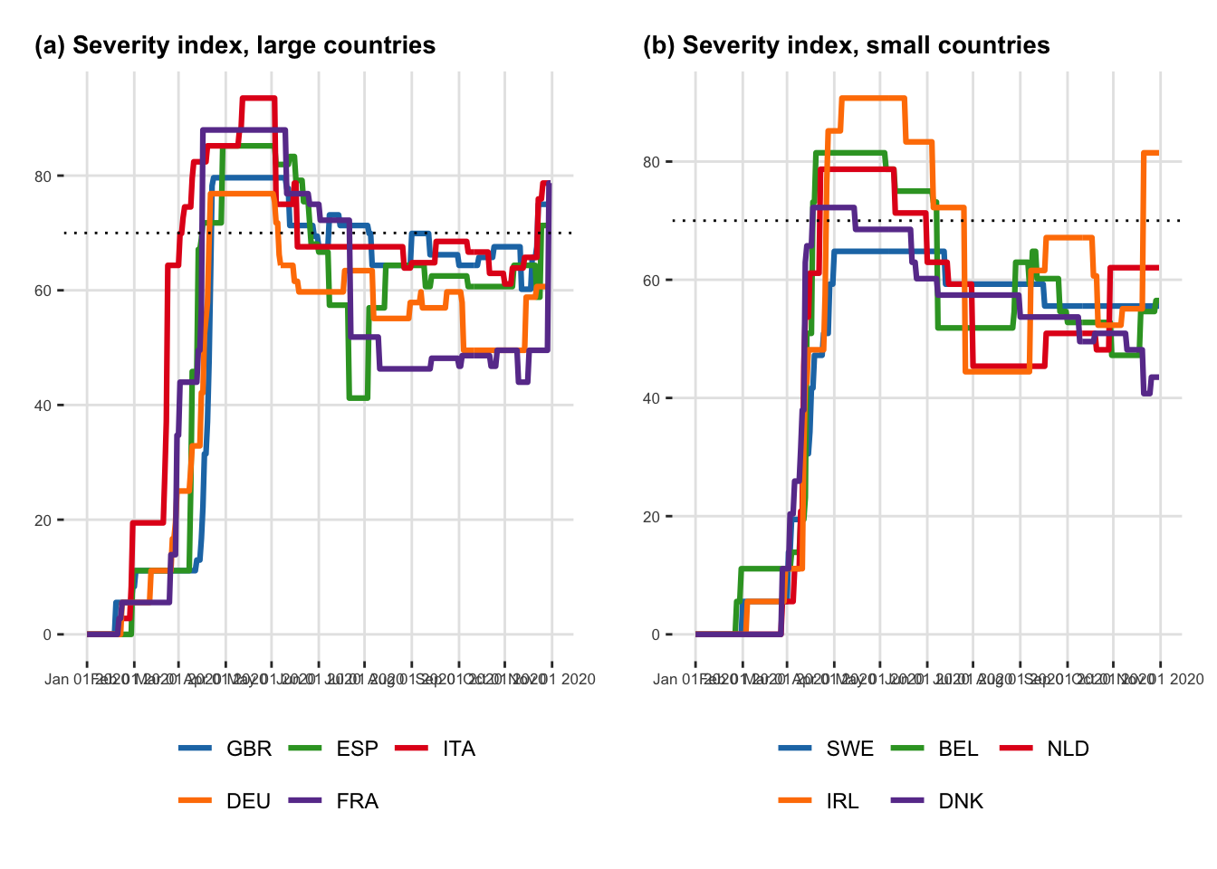
Stringency Index
Let us create a similar plot for the stringency index.
<- |> select (country, country_code, date, stringency_index) |> mutate (country_type = ifelse (%in% c ("France" , "Germany" , "Italy" ,"Spain" , "United Kingdom" ),yes = "L" , "S" )%>% mutate (country_type = factor (levels = c ("L" , "S" ),labels = c ("Larger countries" , "Smaller countries" )
Then we can create the plot for large countries:
<- ggplot (data = df_plot_stringency_index |> filter (country_type == "Larger countries" ) |> mutate (country_code = fct_relevel (country_code, order_countries_L)),mapping = aes (x = date, y = stringency_index, colour = country_code)+ geom_line (linewidth = 1.1 ) + geom_hline (yintercept = 70 , linetype = "dotted" ) + labs (x = NULL , y = NULL ) + scale_colour_manual (NULL , values = colour_countries) + scale_y_continuous (breaks = seq (0 , 100 , by = 20 )) + scale_x_date (breaks = ymd (pretty_dates (df_plot_stringency_index$ date, n = 7 )), date_labels = "%b %d %Y" + theme_paper () + guides (colour = guide_legend (nrow = 2 , byrow = TRUE ))
And for small countries:
<- ggplot (data = df_plot_stringency_index |> filter (country_type == "Smaller countries" ) |> mutate (country_code = fct_relevel (country_code, order_countries_S)),mapping= aes (x = date, y = stringency_index, colour = country_code)+ geom_line (linewidth = 1.1 ) + geom_hline (yintercept = 70 , linetype = "dotted" ) + labs (x = NULL , y = NULL ) + scale_colour_manual (NULL , values = colour_countries) + scale_y_continuous (breaks = seq (0 , 100 , by = 20 )) + scale_x_date (breaks = ymd (pretty_dates (df_plot_stringency_index$ date, n = 7 )), date_labels = "%b %d %Y" ) + theme_paper () + guides (colour = guide_legend (nrow = 2 , byrow = TRUE ))
Lastly, we can plot these two graphs on a single figure:
<- arrangeGrob (# Row 1 + labs (y = NULL , title = "(a) Severity index, large countries" ),+ labs (y = NULL , title = "(b) Severity index, small countries" ),nrow = 1 |> as_ggplot ()
Speed of reaction to the epidemic outbreak
The observation of a first case was the sign that the epidemic had reached the country. What was the delay between this first case and a significant reaction identified when the index was greater than 20?
We can first extract the date on which the severity index reaches the value of 20 for the first time as follows:
<- |> filter (stringency_index >= 20 ) |> group_by (country) |> slice (1 ) |> select (country, date_stringency_20 = date, cases = value) |> ungroup ()
Then, we can get the date of the first case for each country:
<- |> filter (type == "Cases" ) |> group_by (country) |> filter (value > 0 ) |> arrange (date) |> slice (1 ) |> select (country, first_case = date) |> ungroup ()
|> left_join (start_first_case) |> mutate (interval = lubridate:: interval (first_case, date_stringency_20),delay = interval / lubridate:: ddays (1 )) |> mutate (country = fct_relevel (country, names_countries)) |> arrange (country) |> select (country, first_case, delay, cases) |> :: kable ()
Joining with `by = join_by(country)`
Table 4.3: Speed of reaction to the epidemic outbreak
country
first_case
delay
cases
United Kingdom
2020-01-31
46
4452
Spain
2020-02-01
37
1073
Italy
2020-01-31
21
20
Germany
2020-01-27
33
66
France
2020-01-24
36
100
Sweden
2020-02-01
40
771
Belgium
2020-02-04
38
559
Netherlands
2020-02-27
12
503
Ireland
2020-02-29
12
43
Denmark
2020-02-27
5
6
Confinement and deconfinement policies
Let us check how the different countries proceeded with deconfinement.
The date at which the stringency index reached its maximum value within the first 100 days since the end of January:
<- |> group_by (country) |> slice (1 : 100 ) |> arrange (desc (stringency_index), date) |> slice (1 ) |> select (country, start = date)
# A tibble: 10 × 2
# Groups:   country [10]
   country        start
   <chr>          <date>
 1 Belgium        2020-03-20
 2 Denmark        2020-03-18
 3 France         2020-03-17
 4 Germany        2020-03-22
 5 Ireland        2020-04-06
 6 Italy          2020-03-20
 7 Netherlands    2020-03-23
 8 Spain          2020-03-30
 9 Sweden         2020-04-01
10 United Kingdom 2020-03-24
We can easily obtain the date on which the index begins to fall from its maximum value, corresponding to a relaxation of policy measures (i.e. , end of lockdown):
<- |> select (country, date, stringency_index) |> left_join (start_max_stringency, by = c ("country" )) |> group_by (country) |> arrange (date) |> filter (date >= start) |> mutate (tmp = dplyr:: lag (stringency_index)) |> mutate (same_strin = stringency_index == tmp) |> mutate (same_strin = ifelse (row_number ()== 1 , TRUE , same_strin)) |> filter (same_strin == FALSE ) |> slice (1 ) |> mutate (length = lubridate:: interval (start, date) / ddays (1 )) |> select (country, start, end= date, length)
# A tibble: 10 × 4
# Groups:   country [10]
   country        start      end        length
   <chr>          <date>     <date>      <dbl>
 1 Belgium        2020-03-20 2020-05-05     46
 2 Denmark        2020-03-18 2020-04-15     28
 3 France         2020-03-17 2020-05-11     55
 4 Germany        2020-03-22 2020-05-03     42
 5 Ireland        2020-04-06 2020-05-18     42
 6 Italy          2020-03-20 2020-04-10     21
 7 Netherlands    2020-03-23 2020-05-11     49
 8 Spain          2020-03-30 2020-05-04     35
 9 Sweden         2020-04-01 2020-06-13     73
10 United Kingdom 2020-03-24 2020-05-11     48
The average of the strigency index between the max value and the end of containment can be obtained as follows:
<- |> select (country, date, stringency_index) |> left_join (policies, by = "country" ) |> filter (date >= start, date < end) |> group_by (country) |> summarise (strength = mean (stringency_index))
# A tibble: 10 × 2
   country        strength
   <chr>             <dbl>
 1 Belgium            81.5
 2 Denmark            72.2
 3 France             88.0
 4 Germany            76.8
 5 Ireland            90.7
 6 Italy              85.2
 7 Netherlands        78.7
 8 Spain              85.2
 9 Sweden             64.8
10 United Kingdom     79.6
We can count how many smoothing and how many restrengthening actions were made till the end of our sample:
<- |> select (country, date, stringency_index) |> left_join (policies, by = "country" ) |> filter (date >= end, date <= end_date_sample) |> group_by (country) |> mutate (tmp = dplyr:: lag (stringency_index)) |> mutate (tmp = ifelse (row_number ()== 1 , stringency_index, tmp)) |> mutate (same_strin = stringency_index == tmp) |> mutate (smoothing = ifelse (! same_strin & stringency_index < tmp, TRUE , FALSE ),restrenghtening = ifelse (! same_strin & stringency_index > tmp, TRUE , FALSE )|> summarise (changes_smo = sum (smoothing),changes_res = sum (restrenghtening)
# A tibble: 10 × 3
   country        changes_smo changes_res
   <chr>                <int>       <int>
 1 Belgium                  8           3
 2 Denmark                  5           1
 3 France                   6           3
 4 Germany                  9           4
 5 Ireland                  4           2
 6 Italy                    5           4
 7 Netherlands              4           2
 8 Spain                    9           4
 9 Sweden                   1           0
10 United Kingdom           8           4
Lastly, we can gather all this information in a single table:
|> left_join (strength_containment, by = "country" ) |> left_join (policy_changes, by = "country" ) |> mutate (country = factor (country)) |> mutate (country = fct_relevel (country, names_countries)) |> arrange (country) |> mutate (start = format (start, "%B %d" ),end = format (end, "%B %d" )|> :: kable ()
Overview of the smoothing and restrenghthening actions during between the beginning of the Codiv-19 epidemic and November 2020.
Saving the results
Let us save the following R objects for later use.
save (file = "data/data_after_load.rda"
Li, Qun, Xuhua Guan, Peng Wu, Xiaoye Wang, Lei Zhou, Yeqing Tong, Ruiqi Ren, et al. 2020.
“Early Transmission Dynamics in W uhan, C hina, of Novel Coronavirus-Infected Pneumonia.” New England Journal of Medicine 382 (13): 1199–1207.
https://doi.org/10.1056/NEJMoa2001316 .