2  Simulations with R

In this chapter, we use R to simulate a SIR model, with and without lockdown.

2.1 Without lockdown

We can simulate a SIR without lockdown first. Let us adapt the The Matlab codes codes provided by Benjamin Moll.

We will need some functions to manipulate data from {tidyverse}.

library(tidyverse)
── Attaching core tidyverse packages ──────────────────────── tidyverse 2.0.0 ──
✔ dplyr     1.1.2     ✔ readr     2.1.4
✔ forcats   1.0.0     ✔ stringr   1.5.0
✔ ggplot2   3.4.2     ✔ tibble    3.2.1
✔ lubridate 1.9.2     ✔ tidyr     1.3.0
✔ purrr     1.0.1     
── Conflicts ────────────────────────────────────────── tidyverse_conflicts() ──
✖ dplyr::filter() masks stats::filter()
✖ dplyr::lag()    masks stats::lag()
ℹ Use the conflicted package (<http://conflicted.r-lib.org/>) to force all conflicts to become errors

Let us set the reproduction number \(\mathcal{R}_0=2.5\):

reprod_number <- 2.5
Tinf <- 7
beta <- reprod_number / Tinf
gamma <- 1 / Tinf

The choice of the number of periods can be made here:

implicit <- 0
T <- 400    # Length of simulation
dt <- 0.1   # Time step 
Nt <- T / dt + 1
time <- seq(0, T, length.out = Nt)

A matrix with 3 rows can be initiated. Each row corresponds to \(S\), \(I\), and \(R\), resp.

mu <- matrix(rep(0, 3 * (Nt + 1)), nrow = 3)
S <- I <- R <- N <- F <- Re <- rep(0, Nt)

The transition matrices at each time step (we initialize an empty list):

A_t <- vector(mode = "list", length = Nt)

Setting the initial conditions for \(S\), \(I\) et \(R\):

# March 1st 2020 so that March 31st there are appx. 150,000 cases 
# (50% more than measured)
I0 <- 0.35 * 10^(-4) 
S0 <- 1 - I0
R0 <- 0

Let the first column of mu contain the initial conditions for \(S_0\), \(I_0\), and \(R_0\)

mu[,1] <- matrix(c(S0, I0, R0), nrow = 3)

Now, a loop over the different periods can be made. Benjamin Moll uses the matrix form of the SIR model here.

for (n in 1:(Nt - 1)) {
  S[n] <- mu[1, n]
  I[n] <- mu[2, n]
  R[n] <- mu[3, n]
  Re[n] <- reprod_number * S[n]
  A_t[[n]] <- matrix(
    c(
      -beta * I[n], beta * I[n], 0,
      0, -gamma, gamma,
      0, 0, 0
    ),
    byrow = TRUE,
    ncol = 3)
  
  if (implicit == 0) {
    mu[, n+1] <- dt * (t(A_t[[n]]) %*% mu[, n]) + mu[, n]
  } else {
    mu[n + 1, ] <- (I(3) - dt * (t(A_t[[n]])) %/% mu[, n])
  }
}

mu <- mu[, 1:Nt]

Recall that the rows of matrix mu contain the values for \(S\), \(I\), and \(R\), respectively. The columns correspond to the values at all the periods.

S <- mu[1, ]
I <- mu[2, ]
R <- mu[3, ]

N <- S + I + R
D <- 100 - N

df_lockdown <- tibble(S = S, I = I, R = R, t = time, type = "no-lockdown")
df_lockdown
# A tibble: 4,001 × 5
       S         I          R     t type       
   <dbl>     <dbl>      <dbl> <dbl> <chr>      
 1  1.00 0.000035  0            0   no-lockdown
 2  1.00 0.0000357 0.0000005    0.1 no-lockdown
 3  1.00 0.0000365 0.00000101   0.2 no-lockdown
 4  1.00 0.0000373 0.00000153   0.3 no-lockdown
 5  1.00 0.0000381 0.00000207   0.4 no-lockdown
 6  1.00 0.0000389 0.00000261   0.5 no-lockdown
 7  1.00 0.0000397 0.00000317   0.6 no-lockdown
 8  1.00 0.0000406 0.00000373   0.7 no-lockdown
 9  1.00 0.0000415 0.00000431   0.8 no-lockdown
10  1.00 0.0000424 0.00000491   0.9 no-lockdown
# ℹ 3,991 more rows

2.2 With lockdown

Now, let us create a function that will run the SIR model with a lockdown. The code from the SIR model without lockdown is slightly modified, to introduce the lockdown and its severity. The following function allows us to easily make a simulation depending on the start and end of the lockdown, as well as its severity:

#' Simulate the SIR model with a lockdown
#' 
#' @param lock_start start of the lockdown (number of days from the outbreak)
#' @param lock_end end of the lockdown (number of days from the outbreak)
#' @param lock_severity severity of the lockdown (in [0,1], 0 for no lockdown)
simulate_sir_lockdown <- function(lock_start,
                                  lock_end,
                                  lock_severity,
                                  type) {
  # Matrix with 3 rows, each corresponding to S, I and R, resp.
  mu <- matrix(rep(0, 3 * (Nt + 1)), nrow = 3)
  S <- I <- R <- N <- F <- Re <- rep(0, Nt)
  
  # Transition matrix
  A_t <- vector(mode="list", length = Nt)
  
  # First column: initial conditions
  mu[, 1] <- matrix(c(S0, I0, R0), nrow = 3)
  
  lockdown <- rep(0, Nt)
  
  for (n in 1:(Nt - 1)) {
    S[n] <- mu[1, n]
    I[n] <- mu[2, n]
    R[n] <- mu[3, n]
    
    if (time[n] >= lock_start & time[n] <= lock_end) {
      # Lockout
      lockdown[n] <- lock_severity
    }
    
    Re[n] <- reprod_number * (1 - lockdown[n]) * S[n]
    
    A_t[[n]] <- matrix(
      c(
        -beta * (1-lockdown[n]) * I[n], beta * (1 - lockdown[n]) * I[n], 0,
        0, -gamma, gamma,
        0, 0, 0
      ),
      byrow = TRUE,
      ncol = 3)
    
    if (implicit == 0) {
      mu[, n+1] <- dt * (t(A_t[[n]]) %*% mu[, n]) + mu[, n]
    } else {
      mu[n + 1, ] <- (I(3) - dt * (t(A_t[[n]])) %/% mu[, n])
    }
  }
  
  mu <- mu[, 1:Nt]
  
  S_tight <- mu[1, ]
  I_tight <- mu[2, ]
  R_tight <- mu[3, ]
  
  N_tight <- S_tight + I_tight + R_tight
  D_tight <- 100 - N_tight
  
  tibble(S = S_tight, I = I_tight, R = R_tight, t = time)
}

Now let us set the values for a tight lockdown:

lock_start_tight <- 37
lock_end_tight <- lock_start_tight+30
lock_severity_tight <- .7

An let us use those values in the modified SIR model:

df_lockdown_tight <- 
  simulate_sir_lockdown(lock_start = lock_start_tight,
                        lock_end = lock_end_tight,
                        lock_severity = .7) |> 
  mutate(type = "tight-lockdown")

Now let us set the values for a tight lockdown:

lock_start_tight <- 37
lock_end_tight <- lock_start_tight + 30
lock_severity_tight <- .7

An let us use those values in the modified SIR model:

df_lockdown_tight <- simulate_sir_lockdown(
  lock_start = lock_start_tight,
  lock_end = lock_end_tight,
  lock_severity = .7) |> 
  mutate(type = "tight-lockdown")

The following values for the lockdown lead to simulating a loose lockdown:

lock_start_loose <- 37
lock_end_loose <- lock_start_loose + 30
lock_severity_loose <- .4

These values can be used to make a new simulation of the SIR model:

df_lockdown_loose <- simulate_sir_lockdown(
  lock_start = lock_start_loose,
  lock_end = lock_end_loose,
  lock_severity = lock_severity_loose) |> 
  mutate(type = "loose-lockdown")

A moderate lockdown can then be considered, picking the following values:

lock_start_mix <- 37
lock_end_mix <- lock_start_mix + 90
lock_severity_mix <- .425

And these values can be given to the simulation function:

df_lockdown_mix <- simulate_sir_lockdown(
  lock_start = lock_start_mix,
  lock_end = lock_end_mix,
  lock_severity = lock_severity_mix) |> 
  mutate(type = "mix-lockdown")

2.3 Graphs of the evolution

The datasets for each scenario need to be reshaped to be used in ggplot2().

#' Reshape the data from two scenarios
#' 
#' @param df_scenario_1 data for first scenario
#' @param df_scenario_2 data for second scenario
#' @param name_scenario_1 name of the scenario in `df_scenario_1`
#' @param label_scenario_1 desired label for the name of the first scenario
#' @param name_scenario_2 name of the scenario in `df_scenario_2`
#' @param label_scenario_2 desired label for the name of the second scenario
reshape_data_graph <- function(df_scenario_1,
                               df_scenario_2,
                               name_scenario_1,
                               label_scenario_1,
                               name_scenario_2,
                               label_scenario_2) {
  df_scenario_1 |> 
  bind_rows(df_scenario_2) |> 
  pivot_longer(cols = c("S", "I", "R")) |> 
  filter(t <= Nt - 1) |> 
  mutate(name = factor(name, levels = c("S", "I", "R")),
         type = factor(
           type, 
           levels = c(name_scenario_1, name_scenario_2), 
           labels = c(label_scenario_1, label_scenario_2)))
}

We define a theme function to make the graphs pretty (at least for us!).

Code
library(grid)
theme_paper <- function(..., size_text = 8)
  theme(text = element_text(size = size_text),
        plot.background = element_rect(fill="transparent", color=NA),
        panel.background = element_rect(fill = "transparent", color=NA),
        panel.border = element_blank(),
        axis.text = element_text(), 
        legend.text = element_text(size = rel(1.1)),
        legend.title = element_text(size = rel(1.1)),
        legend.background = element_rect(fill="transparent", color=NULL),
        legend.position = "bottom", 
        legend.direction = "horizontal", legend.box = "vertical",
        legend.key = element_blank(),
        panel.spacing = unit(1, "lines"),
        panel.grid.major = element_line(colour = "grey90"), 
        panel.grid.minor = element_blank(),
        plot.title = element_text(hjust = 0, size = rel(1.3), face = "bold"),
        plot.title.position = "plot",
        plot.margin = unit(c(1, 1, 1, 1), "lines"),
        strip.background = element_rect(fill=NA, colour = NA),
        strip.text = element_text(size = rel(1.1)))

And we define a function to plot the evolution of the two scenarios with respect to time.
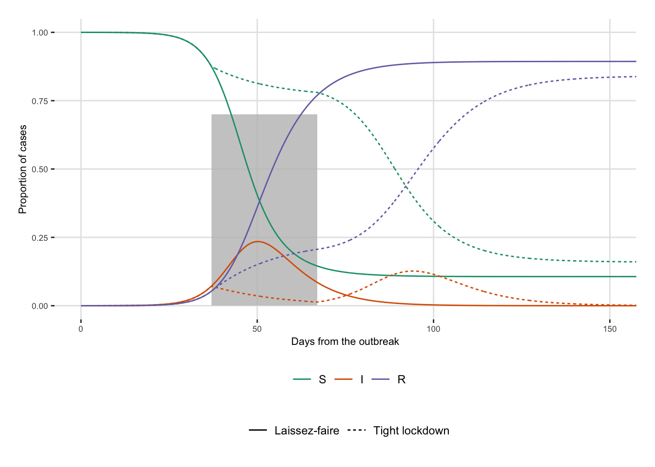
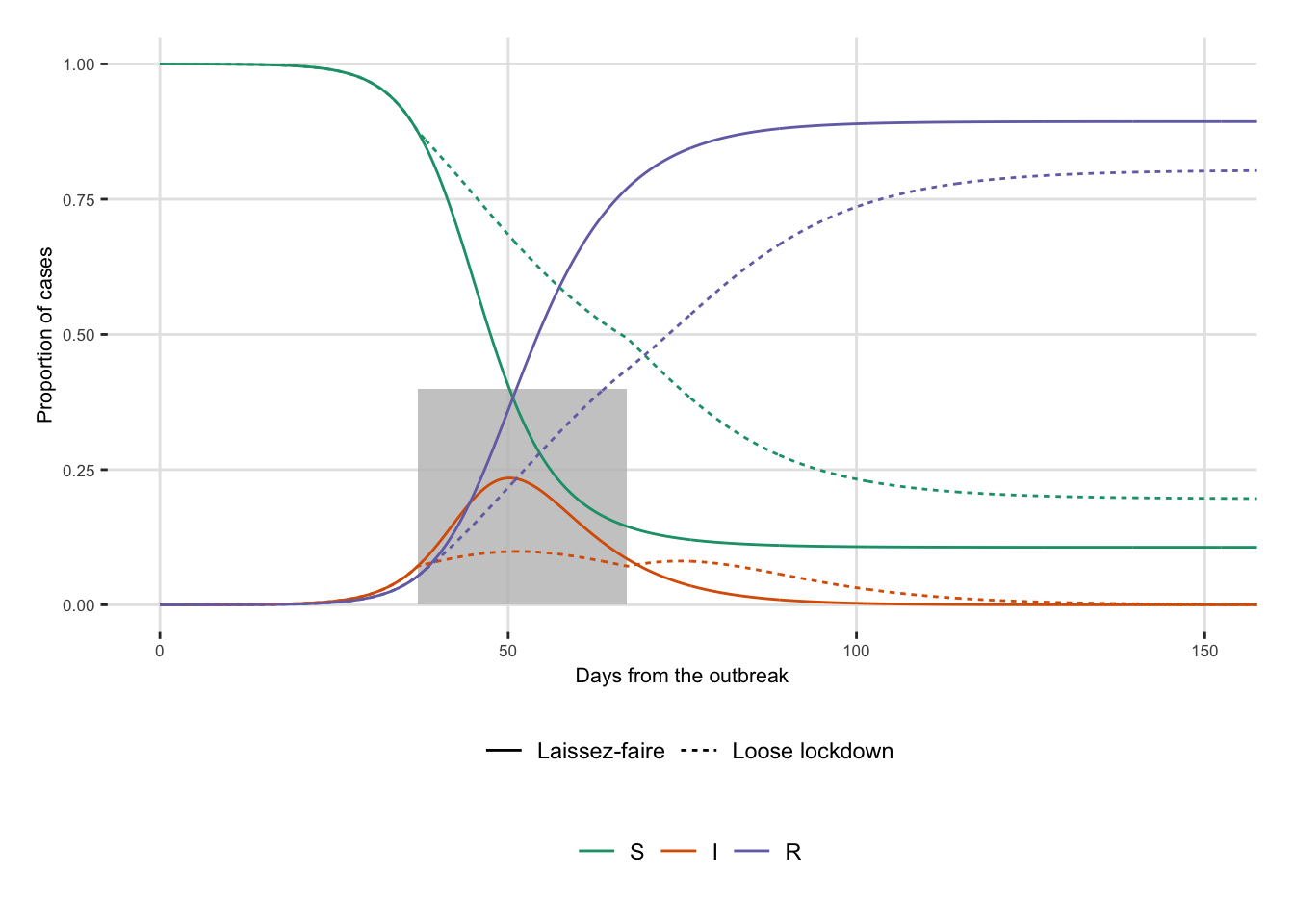
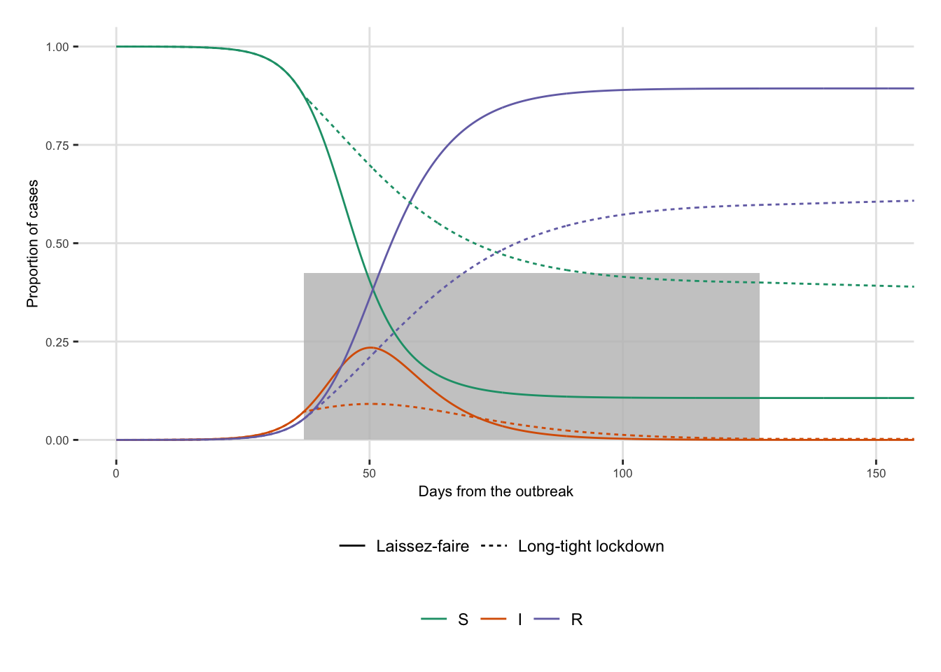
#' Plots the evolution of two scenarios
#' 
#' @param df_plot data with the two scenarios (obtained from 
#' `reshape_data_graph()`)
#' @param lock_start start period of the lockdown
#' @param lock_end end period of the lockdown
#' @param lock_severity severity of the lockdown
plot_scenario <- function(df_plot,
                          lock_start,
                          lock_end,
                          lock_severity) {
  ggplot(data = df_plot) +
  geom_rect(
    data = tibble(x1 = lock_start, 
                          x2 = lock_end,
                          y1 = 0, y2 = lock_severity),
    mapping = aes(xmin = x1, xmax = x2, ymin = y1, ymax = y2),
    fill = "grey", alpha = .8
  ) +
  geom_line(aes(x = t, y = value, linetype = type, colour = name)) +
  scale_linetype_discrete(NULL) +
  scale_colour_manual(
    NULL, 
    values = c("S" = "#1b9e77", "I" = "#d95f02", "R" = "#7570b3")) +
  labs(x = "Days from the outbreak", y = "Proportion of cases") +
  theme_paper() +
  coord_cartesian(xlim = c(0, 150))
}
df_plot_lockdown_tight <- reshape_data_graph(
  df_scenario_1 = df_lockdown,
  df_scenario_2 = df_lockdown_tight,
  name_scenario_1 = "no-lockdown",
  label_scenario_1 = "Laissez-faire",
  name_scenario_2 = "tight-lockdown",
  label_scenario_2 = "Tight lockdown")
plot_scenario(
  df_plot = df_plot_lockdown_tight,
  lock_start = lock_start_tight,
  lock_end = lock_end_tight,
  lock_severity = lock_severity_tight)

df_plot_lockdown_loose <- reshape_data_graph(
  df_scenario_1 = df_lockdown,
  df_scenario_2 = df_lockdown_loose,
  name_scenario_1 = "no-lockdown",
  label_scenario_1 = "Laissez-faire",
  name_scenario_2 = "loose-lockdown",
  label_scenario_2 = "Loose lockdown")
plot_scenario(
  df_plot = df_plot_lockdown_loose,
  lock_start = lock_start_loose,
  lock_end = lock_end_loose,
  lock_severity = lock_severity_loose)

df_plot_lockdown_mix <- reshape_data_graph(
  df_scenario_1 = df_lockdown,
  df_scenario_2 = df_lockdown_mix,
  name_scenario_1 = "no-lockdown",
  label_scenario_1 = "Laissez-faire",
  name_scenario_2 = "mix-lockdown",
  label_scenario_2 = "Long-tight lockdown")
plot_scenario(
  df_plot = df_plot_lockdown_mix,
  lock_start = lock_start_mix,
  lock_end = lock_end_mix,
  lock_severity = lock_severity_mix)

2.4 Phase diagrams

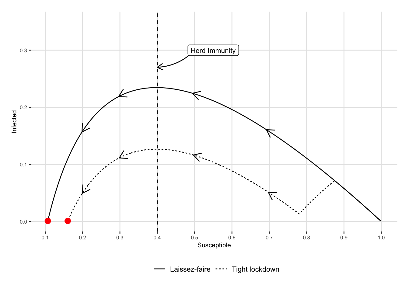
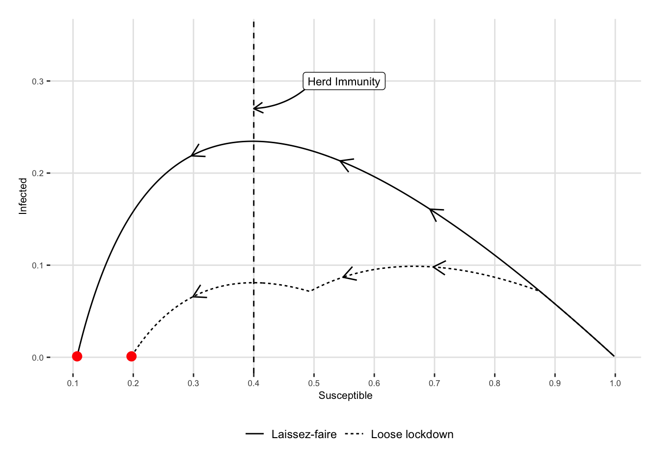
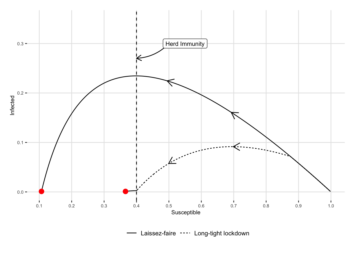
The phase diagrams can also be plotted. Once again, the data need to be reshaped for use in ggplot2.

#' @param df_scenario_1 data for first scenario
#' @param df_scenario_2 data for second scenario
#' @param name_scenario_1 name of the scenario in `df_scenario_1`
#' @param label_scenario_1 desired label for the name of the first scenario
#' @param name_scenario_2 name of the scenario in `df_scenario_2`
#' @param label_scenario_2 desired label for the name of the second scenario
reshape_data_phase <- function(df_scenario_1,
                               df_scenario_2,
                               name_scenario_1,
                               label_scenario_1,
                               name_scenario_2,
                               label_scenario_2) {
  df_scenario_1 |>
    filter(I > 0.001) |> 
    group_by(S) |> 
    slice(1) |> 
    ungroup() |> 
    bind_rows(
      df_scenario_2 |> 
        filter(I > 0.001) |> 
        group_by(S) |> 
        slice(1) |> 
        ungroup()
    ) |> 
    mutate(
      type = factor(
        type, 
        levels = c(name_scenario_1, name_scenario_2), 
        labels = c(label_scenario_1, label_scenario_2))
    )
}

If we want to display some arrows to highlight the direction on the diagrams, we can create a function that will do so for a single scenario.

#' Gives the coordinates to draw a small arrow on the phase diagram of one 
#' scenario
#' 
#' @param df_plot table with the data of the diagram of one scenario ready for 
#' use in ggplot2
#' @param val_S value for S
create_df_arrow <- function(df_plot,
                            val_S) {
  df_arrows <- 
    df_plot |> 
    arrange(desc(S)) |> 
    group_by(type) |> 
    filter(S < !!val_S) |> 
    slice(1:2) |> 
    select(S, I, type) |>
    ungroup() |> 
    mutate(toto = rep(c("beg", "end"), 2))
  
  df_arrows |> 
    select(-I) |> 
    pivot_wider(names_from = toto, values_from = S, names_prefix = "S_") |> 
    left_join(
      df_arrows |> 
        select(-S) |> 
        pivot_wider(names_from = toto, values_from = I, names_prefix = "I_"),
      by =  "type"
    )
}

Then, let us create a function that will plot the phase diagrams for two scenarios.

plot_phase_diagram_scenarios <- function(df_plot,
                                         x_arrows,
                                         reprod_number = 2.5
                                         ) {
  # Ending points of the epidemic
  df_dots <- df_plot |> 
    group_by(type) |> 
    filter(I == min(I))
  
  # Arrow
  df_arrows <- 
    map_df(x_arrows, ~create_df_arrow(df_plot, val_S = .))
  
  # The coordinates of $S$ corresponding to herd immunity
  S_herd <- 1./reprod_number
  curve_scenario <- tibble(
    x1 = S_herd + .1, 
    x2 = S_herd, 
    y1 = .30, 
    y2 = .27)
  label_curve_scenario <- 
    tibble(
      x = S_herd + .15,
      y = .3,
      label = "Herd Immunity"
    )

  # The graph
  ggplot() +
    geom_line(
      data = df_plot,
      mapping = aes(x = S, y = I, linetype = type)
    ) +
    geom_vline(xintercept = S_herd, linetype = "dashed") +
    geom_curve(
      data = df_arrows,
      mapping = aes(x = S_beg, xend = S_end,
                    y = I_beg, yend = I_end),
      arrow = arrow(length = unit(0.04, "npc")),
      curvature = 0
    ) +
    geom_curve(
      data = curve_scenario, 
      mapping = aes(x = x1, y = y1, xend = x2, yend = y2),
      arrow = arrow(length = unit(0.03, "npc")), curvature = -0.2)  +
    geom_label(
      data = label_curve_scenario,
      mapping = aes(x = x, y = y, label = label),
      size = rel(3)
    ) +
    geom_point(
      data = df_dots, 
      mapping = aes(x = S, y = I), 
      colour = "red", size = 3
      ) +
    scale_linetype_discrete(NULL) +
    scale_x_continuous(breaks = seq(0, 1, by = .1)) +
    labs(x = "Susceptible", y = "Infected") +
    theme_paper()
    
}
df_plot_tight <- 
  reshape_data_phase(
  df_scenario_1    = df_lockdown,
  df_scenario_2    = df_lockdown_tight,
  name_scenario_1  = "no-lockdown",
  label_scenario_1 = "Laissez-faire",
  name_scenario_2  = "tight-lockdown",
  label_scenario_2 = "Tight lockdown")

plot_phase_diagram_scenarios(
  df_plot = df_plot_tight, 
  x_arrows = c(.7, .5, .3, .2), 
  reprod_number = 2.5) +
  coord_cartesian(ylim = c(0, .35))

Figure 2.1: Tight Lockdown: Phase Diagram

df_plot_loose <- 
  reshape_data_phase(
  df_scenario_1    = df_lockdown,
  df_scenario_2    = df_lockdown_loose,
  name_scenario_1  = "no-lockdown",
  label_scenario_1 = "Laissez-faire",
  name_scenario_2  = "loose-lockdown",
  label_scenario_2 = "Loose lockdown")

plot_phase_diagram_scenarios(
  df_plot = df_plot_loose, 
  x_arrows = c(.7, .55, .3), 
  reprod_number = 2.5
) +
  coord_cartesian(ylim = c(0, .35))

Figure 2.2: Loose Lockdown: Phase Diagram

df_plot_mix <- 
  reshape_data_phase(
  df_scenario_1    = df_lockdown,
  df_scenario_2    = df_lockdown_mix,
  name_scenario_1  = "no-lockdown",
  label_scenario_1 = "Laissez-faire",
  name_scenario_2  = "mix-lockdown",
  label_scenario_2 = "Long-tight lockdown")

plot_phase_diagram_scenarios(
  df_plot = df_plot_mix, 
  x_arrows = c(.7, .5), 
  reprod_number = 2.5) +
  coord_cartesian(ylim = c(0, .35))

Figure 2.3: Long-tight Lockdown: Phase Diagram